Your website is your virtual storefront, accessible 24/7, and it plays the vital role of shaping first impressions. In todays market, first impressions are lasting impressions. In the physical world we all live in, when you walk into a disorderly store with smudged windows and unhappy employees, it tends to give the impression that the business owners either don’t understand business or it’s not a place you may want to be at.
Take that mental image and apply that to your website. Can your visitors find everything without going through hoops or getting a migraine than bouncing from your website? Or is it a seamless, fluid experience that enchants them?
This kind of basis is why user-friendly sites are important.
Understanding User-Friendly Websites

A user-friendly website is designed with the end-user in mind, meaning that every aspect of the site enhances the visitor’s experience. When you think along the lines of navigation, accessibility, and responsiveness, it will provide immediate and lasting results for your visitors.
Accessibility
Accessibility means making your website usable for as many people as possible, including individuals with disabilities. This involves:
- Alt Text for Images: Providing descriptive text for images so that screen readers can convey the information to visually impaired users.
- Keyboard Navigation: Ensuring that all website functions can be performed using a keyboard, aiding those who cannot use a mouse.
- Proper Heading Structures: Using hierarchical headings (H1, H2, H3, etc.) to organize content logically, which helps screen readers interpret and present information effectively.
- Captions and Transcripts: Including captions for videos and transcripts for audio content to assist users with hearing impairments.
By adhering to accessibility standards like the Web Content Accessibility Guidelines (WCAG), you make your website compliant and also available to a much wider audience.
Intuitive Navigation
Intuitive navigation is the backbone of a user-friendly website. It allows visitors to find information quickly and efficiently, enhancing their overall experience. After all, think of when you search Google, and you’re in need of some information but every page you pick is lacking in your ‘search intent’. You bounce off that website, right?
If you’re pulling them with promises of information for their intent, it’s best to have that information right where they can get it, as soon as possible, and having any additional information nearby.
- Clear Menu Structure: Organize your site’s main pages in a logical sequence, using familiar terms like “About Us,” “Services,” and “Contact.”
- Search Functionality: Implement a search bar to help users find specific content without navigating through multiple pages.
- Breadcrumbs: Use breadcrumb trails to show users their current location within the site hierarchy, making it easy to backtrack.
- Consistent Navigation Elements: Keep menus, buttons, and links consistent across all pages to avoid confusing users.
Responsive Design
Not everyone is going to wait to go home to search out your website. Just about everyone does have a cellphone with access to the internet, though. So have a website that can be used on each and every device so you don’t miss out on any potential visitors (US Government, please take notes).
- Flexible Layouts: Use CSS media queries to adjust the layout based on the screen size and orientation.
- Optimized Images: Serve appropriately sized images for different devices to improve load times.
- Touch-Friendly Elements: Design buttons and interactive elements that are easy to tap on smaller screens.
With mobile devices accounting for over half of global web traffic, according to Statista, responsive design is no longer optional, it’s mandatory.
Benefits of a User-Friendly Website

The benefits can compound if done in a well planned manner. At first it’ll be a couple users, then it can become hundreds and sooner than you think it thousands may be combing your website. Not to mention the Google bots eat it up.
Enhanced User Experience
A positive user experience (UX) is extremely important for keeping visitors on your site and encouraging them to interact with your content. I’ve spent long times on websites just because of a few certain features.
- Lower Bounce Rates: When users find your site easy to navigate and informative, they’re less likely to leave immediately.
- Increased Time on Site: Engaging content and smooth navigation encourage users to explore more pages.
- Higher Engagement: Users are more likely to fill out forms, subscribe to newsletters, or make purchases when their experience is seamless.
Improved SEO Rankings
Search engines prioritize websites that offer a great user experience. Just as much as it reflects on potential visitors, Google or any other search engine such as Bing, take notes and value things like fast loading times, versatile & mobile friendly.
Having an engaging website ripe with juicy bits of information and a fluid user interface is like a feast for the crawling bots that comb your website. With enough of it, not only will search engines engorge themselves on your content, but the visitors won’t be bouncing as much, if at all.
Increased Conversion Rates
User-friendly websites remove barriers that might prevent visitors from becoming customers.
By not having a overly complicated layout or malfunctioning software, you won’t confuse or make your visitors go ‘UGH!’
Not optimizing mobile friendliness is one of those barriers. Yes desktop is important but as I said before, not having it is going to cripple your CRO (or Conversion Rate Optimization).
Higher Customer Retention
Keeping visitors engaged or retained with your website is optimal, You want them staying more and more time, cause if they are then it likely leads to better conversion.
- Personalized Experiences: Implementing user-friendly features like personalized content can increase loyalty.
- Consistent Performance: Reliable functionality and quick load times keep users coming back.
- Engagement Opportunities: Features like comment sections or forums encourage community building.
If they come back, they’re probably going to stay with you. Next stop, your front door!
Key Elements of a User-Friendly Website

Think of every website you love to spend time on, even those social media websites. The pages that engage you are often the ones that have things optimized for you.
Fast Load Times
We aren’t in 2004 anymore so DSL should stay in the past. Today, people are used to blinking and the site being loaded.
- Optimize Images: Use image compression tools to reduce file sizes without compromising quality.
- Minify Code: Remove unnecessary characters from HTML, CSS, and JavaScript files.
- Enable Caching: Use browser caching to store frequently accessed resources locally.
According to Google, 53% of mobile users abandon sites that take longer than three seconds to load. I’m one of those people. I don’t even watch videos that take time to load on websites. I’m not gonna wait for the ad to even load, I’ll just look it up on YouTube if I’m invested in that.
Clear Call-to-Actions (CTAs)
It’s not that people need a CTA, but it helps remind them why they’re there. If they are searching for your niche style of business, that is. Having a well placed CTA helps alongside navigation. Me personally don’t need it forced every two steps while looking. If customers are interested in what you got, they’ll hit that little CTA and you get that oh so sweet conversion.
- Visibility: Place CTAs where they’re easily noticeable, such as above the fold or at the end of content.
- Clarity: Use concise language like “Sign Up Now” or “Get a Free Quote.”
- Design: Use contrasting colors and whitespace to make CTAs stand out.
Think of it as a guiding hand, your digital neon sign if you will.
Consistent Design
First time I ever did an art project, I got color happy until it all turned into a sopping gray mess. It amounted to nothing. Kind of relevant when you swing by a website and none of the design makes sense.
If your color scheme is blue and orange, don’t make the other half of the page gray and teal, it’s going to confuse your brand. I’ve only seen it twice, but don’t use a different font style for every other sentence, please. It’s hard to stay on board with flip-flopping fonts. If you’re dedicated to Comic Sans, just commit to it.
Think of your layout as well, having it jam jumbled about will confuse everyone, including the bots, visiting your site.
Here’s some the beautiful boys at Blue Sky has done.
Implementing User-Friendly Features
This isn’t a one and done deal. Yes, applying user-friendly optimization techniques are great, and going overboard with them can be your unmaking, that being said it’s an ongoing thing. Learn what works for you and what doesn’t. Comb the website yourself, and have your friends and family tell you what works and what doesn’t.
The digital landscape that is your website will have to be maintained overtime.
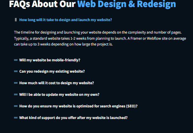
FAQ’s are an easy method to help users find exactly what they’re looking for, in a concise manner.
Conduct Usability Testing
Have your team members, friends or family go through your website. Get some good pointers from them. Even the ones that nitpick you. Treat it as objective criticism.
- User Feedback: Gather insights directly from your audience about their experience.
- Identify Pain Points: Discover obstacles that prevent users from achieving their goals.
- Iterative Improvements: Use findings to make data-driven changes.
If you got the resources to have focus testing done, then go for it. That can yield the most analytics in your approach.
Prioritize Content Readability
It’s tempting to have your content be robotic, or ‘intelligent’, but not everyone wants to have their brain worked while searching with the intents they have.
- Whitespace Usage: Use whitespace to give content room to breathe.
- Visual Aids: Incorporate images, infographics, and videos to complement text.
- Readable Line Length: Keep lines of text between 50-75 characters for optimal readability.
Having your website to be easy to digest isn’t ‘dumbing it down’, it’s sugarcoating it so it goes down sweeter.
A user-friendly website is more than just good design; it’s about understanding your audience’s needs and exceeding their expectations. 44
Remember, your website is often the first impression potential customers have of your business. Make it count by providing a seamless, enjoyable experience that encourages them to engage with your brand.
Or looking for that premium upgrade to get your website optimized? Contact us today to discover how we can help make your site more user-friendly and boost your business growth.